

Fall 2025
Rationale
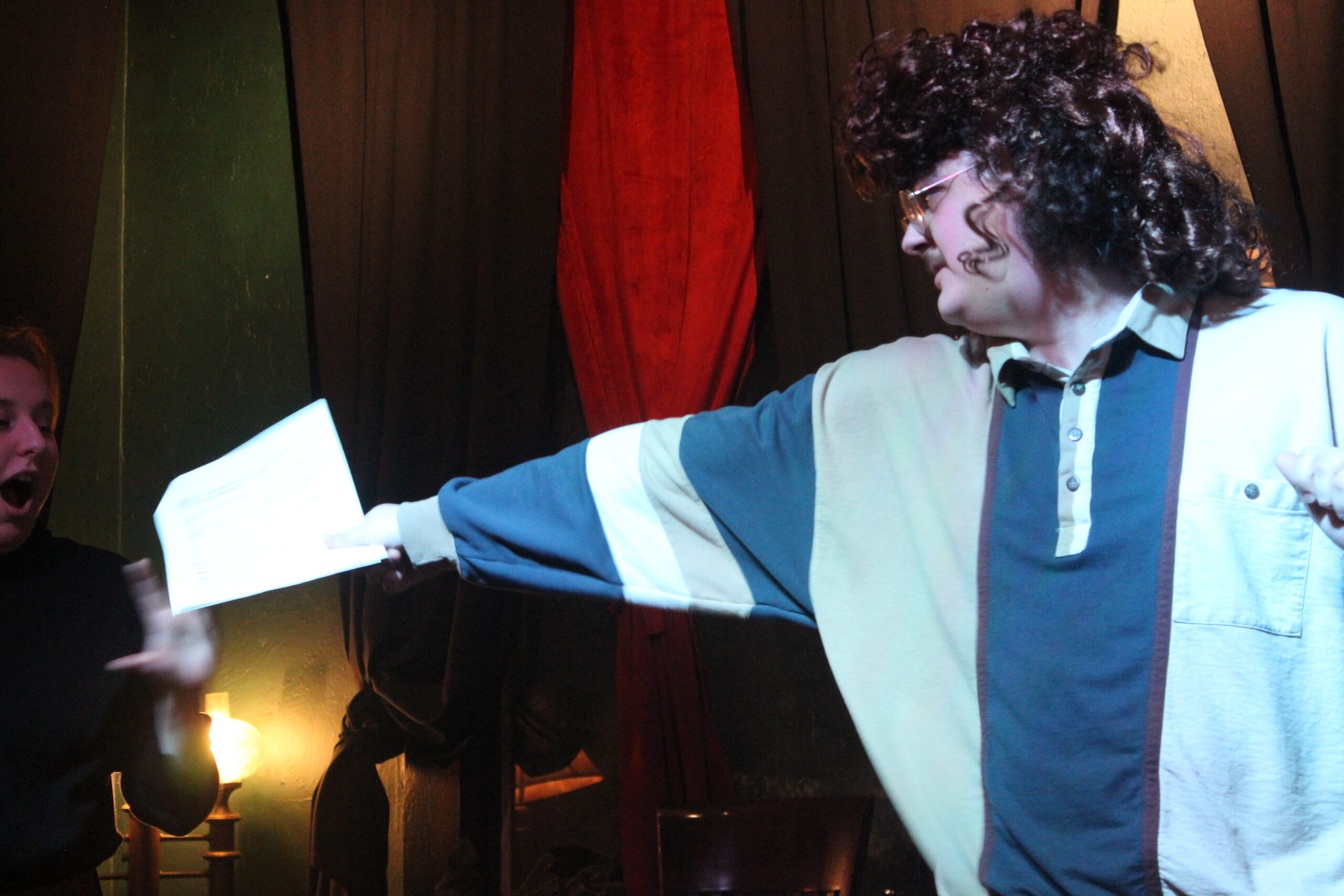
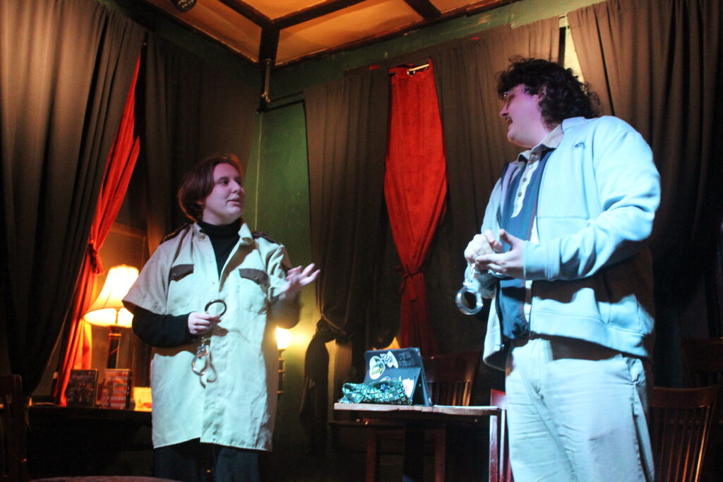
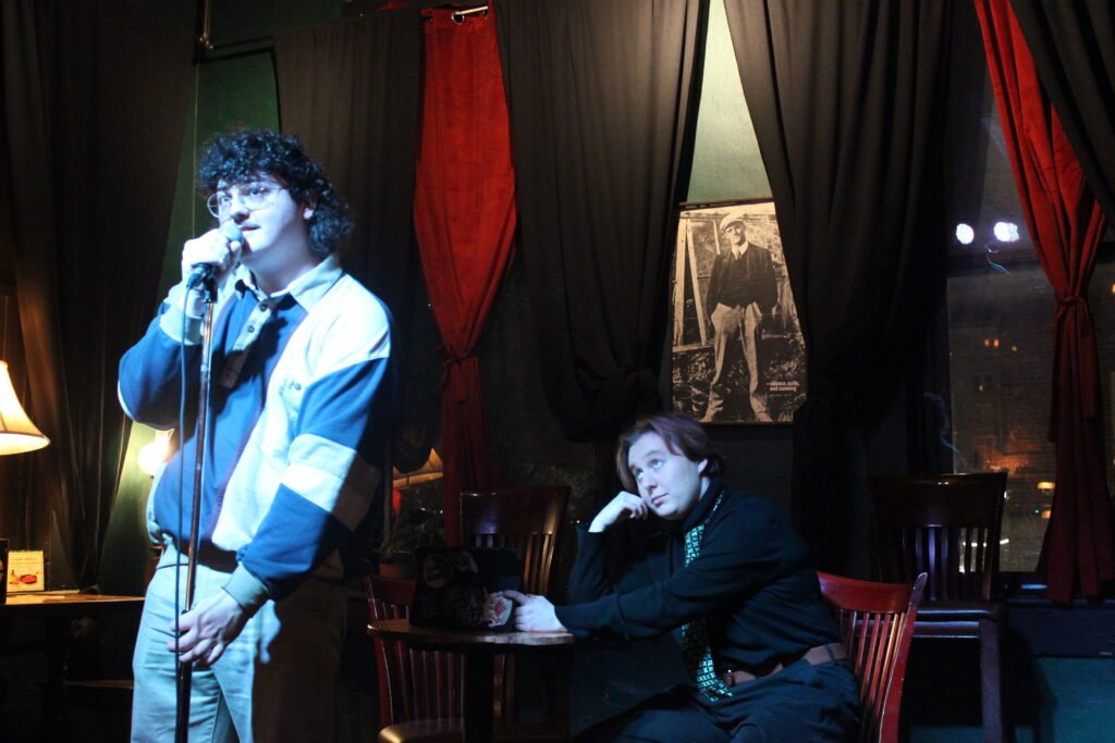
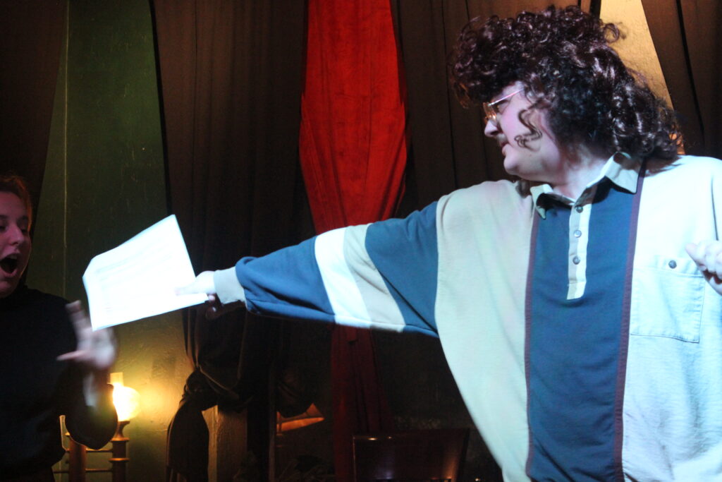
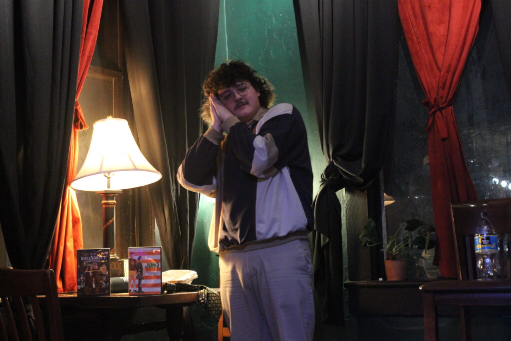
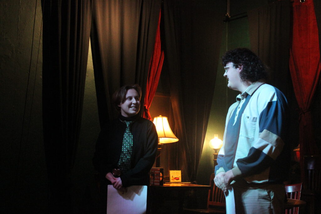
Covering this event was a major photography challenge that shaped my design decisions. Shooting in low light with manual settings for the first time led to blurry photos, which inspired me to emphasize motion through drop shadows and composition—like using Tim’s arm to guide the eye. The venue’s warm atmosphere clashed with cool-toned lighting, so I balanced the palette with red, blue, and green accents. I focused on UX by grouping captions with photos and floating text to avoid trapped space. To match the show’s silly tone, I chose the DIN sans serif family for its clean energy and contrast with the moody color scheme.

Leave a Reply